|
Key Takeaways
|
|
The great thing about Rally is that it produces a wealth of data that you can use to help improve your processes and outcomes (among other things) while you’re working.
The challenge, though, is that if you don’t know how to make sense of the data, or even where to look for it, you’re at risk of not making the most of your teams, processes, and Rally. We don’t want that. We want to make sure that you’re able to get the most out of everything and create a system of continuous improvement that will help you thrive.
Heather Kanser and Chris Pola have introduced a webinar series specifically on the topic of unlocking excellence with agile analytics. Heather and Chris have extensive experience helping clients around the world to more fully leverage agile analytics. The purpose of this webinar series is to help viewers improve planning, tracking, and forecasting. These webinars will demystify common agile metrics and provide practical knowledge so teams are empowered to identify actions that can fuel continuous improvement.
You can watch the first webinar of the series, titled “How To Interpret Data from Burnup/Burndown Charts Using Rally.” I’ve also compiled a summary of the main points in the sections below.
A Look at the Data Rally Can Produce
One of the things that can prevent people from getting deep into the data available is the volume of charts and reports that Rally provides. We will divide that data into several categories. The first category we’ll examine is burndown and burnup charts. Here are just a handful of popular burndown and burnup graphs:
- Iteration Burndown / Burnup
- Release Burnup
- Story Burndown / Burnup
- Portfolio Item Burnup
- Tagged Story Burnup
- Milestone Burnup
These graphs are useful in identifying patterns and correlations that can guide improvements. By gaining an understanding of widely used charts, such as the iteration burndown chart and release burnup chart, you will be empowered to make use of any of the burndown and burnup charts.
Burndown Charts
The iteration burndown app displays work remaining and completed in the iteration. This can help teams anticipate whether the committed work will be delivered by the iteration end date. The following example shows what these graphs look like.
The iteration burndown chart helps identify whether the team is on track to meet their commitments. This chart requires that, on a daily basis, the team tasks out their stories and updates the remaining “to do” hours on each task.
As you can see in the example above, each y-axis represents a different unit. The left y-axis is in hours and is used for both blue bars, which represent the task to do values. The black line represents the ideal burndown rate. The right y-axis is the accepted value in points, which corresponds to the green bars.
As the delivery team members work on their tasks, the task to do (hours) are decreasing each day and remain below the ideal line (black line). Even if a team is keeping their blue bars below the ideal line, if the green bars do not appear until later in the Iteration, that could mean the team is at risk of receiving feedback late and encountering a QA bottleneck.
You want to see the green bars steadily increase as this means the team is getting work completed and accepted by the PO.
Burndown Examples
There is only so much learning that can happen from a “happy path” example. To help, we’ve got some real-life examples of burndown charts. We’ll walk you through what you’re looking at and why the chart looks the way it does.
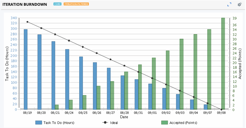
Example #1
In this example, you can see that the blue bars, the task to dos, aren’t moving all that much during the middle of the iteration. You can see that work is being accepted early and throughout the iteration because the green bars are rising. One possible explanation for the minimal daily movement in the blue bars during the middle of the iteration is that the team is new to Rally and is forgetting to update their tasks at the end of the day.
If you look closely, you can see many of the to do task hours drop off on the last day. This could further support the theory that team members simply weren’t updating the tasks throughout the iteration and made most of the updates to the tasks on the last day. However, if that was the case, we probably wouldn't see much growth in the green bars since the tasks have to be completed for the stories and defects to be accepted. More likely, the team overcommitted and removed many of the stories and defects on the last day, which would explain the sudden drop in the blue bar on the last day. In either case, ideally the team would have noticed this and made the necessary adjustments earlier in the iteration.
Example #2
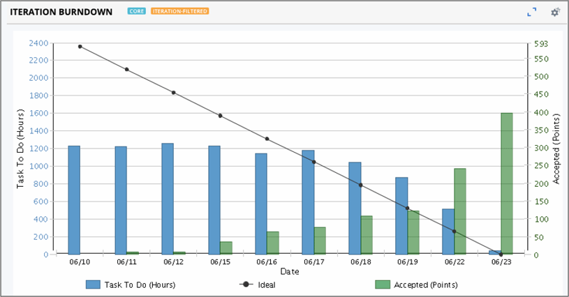
The first thing that jumps out when looking at this chart is the large gap between the ideal burndown value (black dot) and the to do value (blue bar) on the first day. Typically, this gap (if any) is usually small on the first day since the team hasn’t had time yet to work on the tasks. A large gap like this is seen on a team that is adding tasks (or task hours) throughout the iteration. Adding tasks during the iteration will cause the ideal line to recalculate to accommodate for the new task hours. But adding work on a given day will not affect the blue bars on prior days. This can result in a large gap being created.
This particular chart is for a scrum of scrums (or collection of teams working together with a shared iteration cadence). As a result, the values in the y-axis are expectedly large. Another pattern supporting the hypothesis that the teams are adding work throughout the iteration is the fact the blue bars are remaining fairly flat. This would happen if each day the teams are adding a similar number of task hours as they are completing for that day.
As for the accepted work (green bars), it is great to see some work being accepted early in the iteration, however, on the last day, it appears that around 400 of the 590 points were accepted, which means the team didn’t meet their commitment. Teams can use this information to help improve planning for the next iteration. Improving planning leads to greater predictability and removes waste.
To learn more about burndown and burnup charts, watch the webinar “How To Interpret Data from Burnup/Burndown Charts Using Rally.”
Burnup Charts
The release burnup app shows you the work delivered so far in the release. This view can help teams proactively anticipate whether the release scope will be delivered. The chart helps teams identify whether they are on track to meet their release commitments.
On a burnup chart, the black line represents the total number of story and defect points that are scheduled for each day of the release. Changes in the black line (total work points) indicate scope change. We expect some scope change throughout the release, however, large changes could indicate the teams didn’t finish planning the release or that they changed priorities.
The y-axis unit is points. Teams need to size their work to make use of this chart.
Ideally, team members swarm on the highest priority work and get work completed and accepted early in the release. This is evident by seeing green bars (representing accepted work) early in the release. Throughout the release, we want to see the green bars steadily increase as this indicates the teams are regularly getting work completed and accepted. It also reveals teams are getting feedback loops started for each item.
Ideally, on the last day, the scheduled work items (black line) and accepted work items (green bars) converge. A gap in the two values on the last day indicates work that wasn’t accepted during the release.
Burnup Chart Examples
As with the charts above, the best way to truly understand the data in burnup charts is by looking at specific, real-world examples. This way you can see exactly how what’s happening on the chart relates to what’s happening with the team.
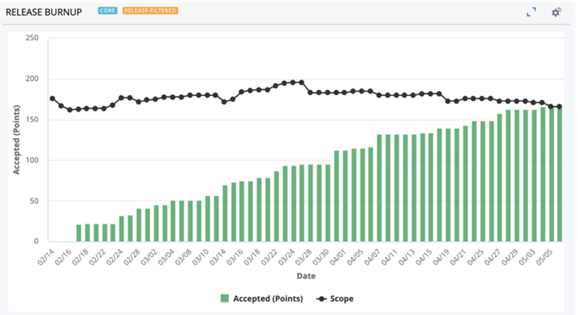
Example #1
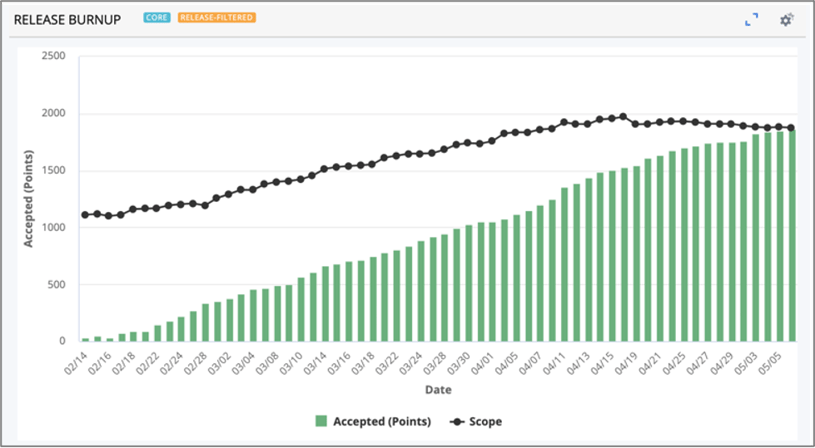
Here you can see the scope is steadily increasing throughout most of the release AND all work is accepted by the end of the release. The increasing scope indicates the team members are adding more work to the release as they finish work. This often happens when features haven’t been fully decomposed at the start of the release and child stories continue to get created. Towards the end of the timebox, the team stopped adding work, as you can see by the black line flattening out. This indicates the team focused on finishing what was in the plan.
You can predict how much work the team is going to be doing based on how consistent the growth of the green bars is, which makes planning easier. These are often patterns we see on mature teams. For teams like this that haven't fully decomposed their features into stories at the start of the release, there is great value in using a feature release burnup chart to track scope change and progress on the features.
Example #2
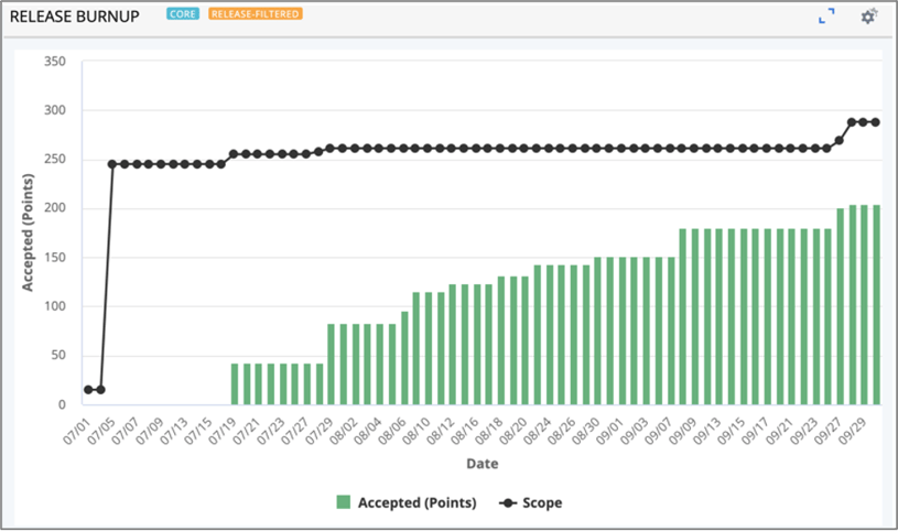
This burnup chart is less than ideal. For starters, there’s no work being completed or even entered into the system for the first few days. It’s not clear whether this happened because the team was busy wrapping up the work from the last iteration or if they were still planning. But, as you can see by the black line, they planned for a lot of work to be done during the release and they added to the scope a couple times, including towards the end of the release. This is odd in this situation because it was evident they were not on track to finish what was already planned.
This team would have benefited from having reviews throughout the release to steer the contents. Additionally, they can use this information to improve planning for the next release. For example, hopefully this team plans less than 200 points for the next release. You’ll get more work done and increase predictability if you plan closer to what the team is capable of, rather than pushing everyone too hard and asking them to over commit.
Want to learn more?
If you’d like a deeper dive into burndown and burnup charts, we’ve got a webinar that expands on this post and covers more real-world examples. You can find it here. In addition to burndown and burnup charts, you can take part in our extended webinar series to unlock excellence with agile analytics in Rally. Found on BrightTALK, these webinars are intended to help teams improve planning, tracking, and forecasting. In the webinars, Rally Software experts will demystify common agile metrics and provide practical knowledge so teams are empowered to identify steps they can take realize continuous improvement. Following is a list of webinars in the series:
- How To Interpret Data from Burnup/Burndown Charts Using Rally—July 26 @ 1:00 pm ET
- How To Interpret Data for Cumulative Flow Diagram Charts Using Rally—September 27 @ 1:00 pm ET
- How To Interpret Data for Throughput and Cycle Time Using Rally—October 4 @ 1:00 pm ET
- Advanced Material: Rally Insights Framework (Advanced Class)—Registration will open soon on BrightTALK
- Advanced Material: Smart Cumulative Flow Diagram and Cycle Time (Advanced Class)—Registration will open soon on BrightTALK
- Dashboarding Roles—Registration will open soon on BrightTALK
- Dashboarding Rituals—Registration will open soon on BrightTALK
- How to best prepare for Big Room Planning (BRP) / PI Planning with Todd Galloway, RTE for Rally Software—Registration will open soon on BrightTALK
Ready for more? Download the full eBook here:


Michelle Kerby
Michelle brings more than 20 years of experience in marketing and sales leadership for Fortune 500 companies. She is passionate about solving customer challenges and creating loyal evangelists. Michelle is based in Silicon Valley.
Other resources you might be interested in
Network Observability NCM
See how Network Observability NCM delivers network configuration management capabilities that automate remediation, ensure compliance, and mitigate risk.
Rally Office Hours: July 2, 2026
Explore the July 2, 2026, Rally Office Hours session covering OAuth security updates, the new portfolio item flow states beta, and upcoming event news.
Unleashing Enterprise Agility: The Power of Portfolio Kanban Flow States
Learn how Rally's Customizable Portfolio Item Flow States (PIFS) balance team autonomy with executive visibility to accelerate enterprise value delivery.
Chart Your Team’s Analytics Journey with Customizable Dashboards in DX NetOps
DX NetOps now features customizable dashboards, providing standards-based flexibility and an easy way for new and existing users to add custom dashboards.
What’s New in Network Observability for Summer 2026
Find out about the updates coming to Network Observability by Broadcom. See how you can reduce alert fatigue, automate compliance, and simplify management.
Rally Office Hours: June 25, 2026
Explore product tips, including AI-driven story creation, and stay updated on the latest Rally news and upcoming collaborative events for July and August.
Rally Office Hours: June 18, 2026
This session covers new in-app notifications, OAuth security updates, technical Q&A on widgets, and upcoming product roadmap sessions for the community.
Clarity Roadmaps: From Strategy to Execution
Learn how to use Clarity roadmaps to connect investments, timelines, financials, and delivery commitments in a single view.
Rally Office Hours: June 11, 2026
Watch the June 11, 2026, Rally Office Hours for updates on Academy resources, custom page migration goals, AI documentation, and upcoming Q3 roadmap news.